Show Us Your Dentrix Patient Chart Layout
 Fans of the newer versions of Dentrix’s Patient Chart know that the ability to move modules around is a great feature. We have set up slightly different views in hygiene rooms from the views in operative and administrative, and the flexibility Dentrix offers is much appreciated.
With a patient chart view, I want to maximize the space I have. Each operatory has a 24†widescreen monitor at the 12 o’clock position, and without having to click on a tiny icon, I want to be able to quickly see the patient’s existing treatment, treatment plan, and the Clinical Note from the last visit. (I want other modules to appear, too, but that is the subject of another article.) I really want to see more history than that, though, and the default setting for the Clinical Note wastes a lot of space inserting blank lines between each Progress Note item.
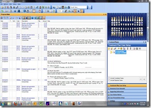
I have solved this on most of my computers. I removed unwanted columns from the Progress Notes screen (right-click on any of the column heads like Date, Tooth, Code, etc and select from the menu). Notice that Dentrix puts Notes on a second line in the column headers by default. Simply drag this item up to the first line to the right of Amount, and you’ll see tons of white space disappear. The result is that I can easily Clinical Notes for the most recent 5-7 appointments.
What look have you settled on? Post a link to a screen shot so we can see! (the best way to grab a screen is to use Vista/7’s Snipping Tool. Hit the Windows key on your keyboard, and type in Snipping Tool, and select it from the start menu results. Get a Window snip, then edit it in something like paint to remove personal information. It should take about 5 minutes to complete this portion, but it will be a help for years to come for the rest of us.)


